Skip to content

This gallery uses the full example data shipped in inst/extdata. It is the closest match to the package’s real-world supported examples.

GWAS

gwas <- import_gwas(ggpop_extdata("gwas", "gcta.mlma"), type = "gcta")
plot_manha(gwas)
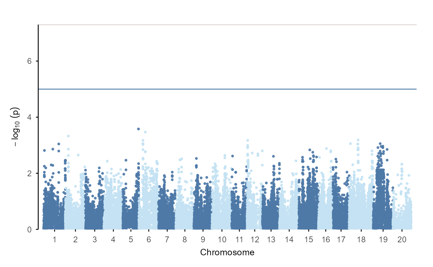
Manhattan plot from the bundled GCTA result file. Chromosomes are arranged along the x-axis and minus log10 p-values are on the y-axis, with horizontal reference lines marking GWAS thresholds.

plot_qq(gwas)

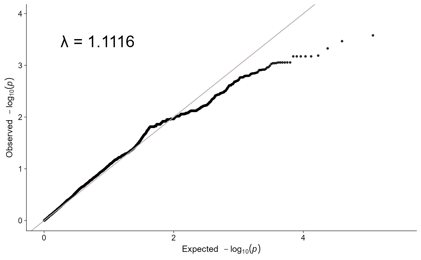
Q-Q scatter plot from the bundled GCTA result file. Expected minus log10 p-values are on the x-axis and observed minus log10 p-values are on the y-axis, with points compared against a diagonal reference line.

PCA

pca <- import_pca(
  ggpop_extdata("pca", "gcta.eigenvec"),
  type = "gcta",
  eigenval = ggpop_extdata("pca", "gcta.eigenval"),
  pop_group = ggpop_extdata("pop_group.txt")
)
plot_pca(pca)
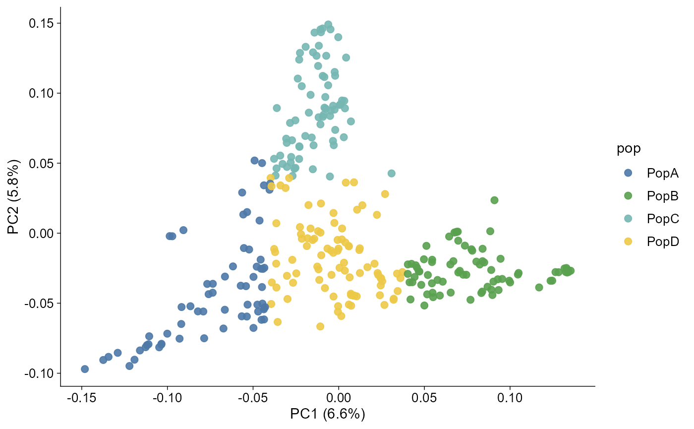
Scatter chart from the bundled GCTA PCA eigenvector file. Principal components define the axes and point colour encodes imported population groups from the shared pop_group.txt metadata.

Admixture

admix <- import_admix(
  ggpop_extdata("admixture"),
  type = "admixture",
  ind = ggpop_extdata("snp", "finalsnp_ld.fam"),
  pop_group = ggpop_extdata("pop_group.txt")
)
plot_admix(admix, k = "all", order_group = TRUE)
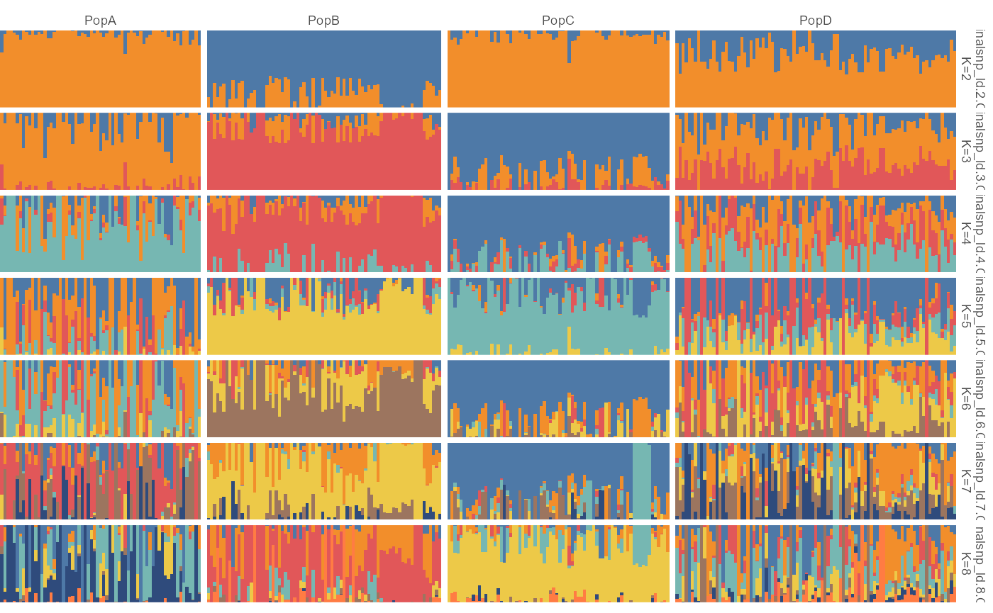
Faceted stacked bar chart from the full bundled ADMIXTURE results. Each K panel shows individuals as bars, ancestry proportions as stacked segments, and population labels used to group samples.

The same data also works with the layered path:

ggpop(admix) + geom_admix(k = 3, order_group = TRUE)
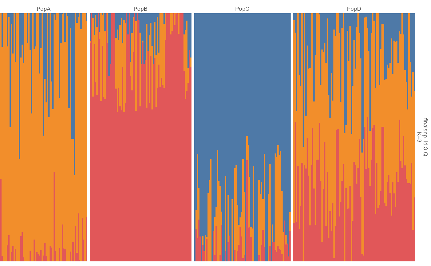
Stacked bar chart for K equals 3 from the layered ggplot workflow. Individuals are grouped by population metadata and each bar shows ancestry proportions summing to one.